


24 Jun 2026
Okay so I want to tell you something embarrassing before we get into anything else. My first book looked absolutely horrible. Not the writing, I actually felt okay about the writing. But the formatting? Genuinely painful to look at. I remember opening that printed copy for the first time and just standing there thinking how did I not catch this. The text was squished, the chapter headings were all over the place, one section randomly had a bigger font because I had copied something from another document months earlier and completely forgot about it. It was the kind of thing that makes you want to quietly pretend the book never existed.
That disaster is actually why I know anything about professional book formatting today. Because after that experience I went and actually learned it properly, talked to people who had been doing it for years, made more mistakes along the way, and slowly figured out what separates a book that feels good to read from one that quietly drives readers away. And honestly most authors treat professional book formatting like an afterthought when it should be one of the first things on your mind.
When formatting is done really well, readers have absolutely no awareness of it. They just read. They get lost in the pages, they lose track of time, they forget they are even holding a physical object. That invisibility is not a failure of the formatting. That invisibility IS the formatting doing its job perfectly.
Nobody Notices Good Formatting and That Is Exactly the Point
The moment formatting becomes visible is the moment something has gone wrong. Too tight line spacing, margins that are way too narrow, fonts that look fine in a heading but feel exhausting after three pages of body text. These things pull readers out of the experience without them even understanding why. Eventually, readers start feeling tired. The book gets set aside, often without much thought. In many cases, it never gets picked up again.
I have had friends tell me they could not get into a book I recommended and when I looked at their copy I immediately understood. The writing was genuinely good. But the pages felt dense and uncomfortable in a way that made reading feel like effort rather than pleasure. That is a formatting problem and it is a fixable one.
Breaking Down What Professional Book Formatting Actually Looks Like
Let me just walk you through the real stuff here, the actual decisions that go into making a book feel like it was put together by someone who knew what they were doing. None of this is complicated once you see it laid out.
Margins Are Doing More Work Than You Realize
Before I started taking formatting seriously I genuinely used whatever margin size Word defaulted to. I did not even think about it as a real decision. But margins in a printed book have an actual physical job. They give readers somewhere to hold the book without their thumbs landing on the text. They give the eyes a natural resting boundary. Without enough margin space a page starts feeling claustrophobic even if the reader cannot pinpoint what is wrong.
Printed books typically land between 0.75 and 1.25 inches on margins and thicker books usually need a slightly wider inner margin because the binding pulls that edge inward when the book is held open. That detail alone makes a noticeable difference in how readable a book feels.
Page size is another thing I never used to think about. Six by nine inches is common for trade paperbacks but it is genuinely not right for every kind of book. A poetry collection crammed into standard trade paperback dimensions feels wrong. A workbook or a guide with lots of charts and tables might need something wider. The physical shape of the object you are creating should match what is actually inside it.
Fonts That Feel Comfortable Across Three Hundred Pages
This is where I see so many well meaning authors go wrong and honestly I went wrong here too. We pick fonts that look beautiful. Fonts that catch our eye. Fonts that feel expressive and personal. And then we wonder why reading the finished book feels oddly tiring.
A font that looks gorgeous on a cover or a chapter heading is not necessarily a font that works for three hundred pages of continuous body text. These are genuinely different requirements. For printed body text you almost always want a serif font, something like Garamond or Palatino or Georgia. Those little strokes at the ends of the letterforms help the eye move naturally along a line of text. Over long stretches of reading this reduces fatigue in a way that is subtle but real.
Font size for body text usually sits between 10 and 12 points. Line spacing typically runs between 120 and 145 percent of the font size. I know that sounds like technical stuff but all it really means is that the lines need a little room to breathe. When lines are packed too tight together the page starts to feel like a wall and readers bounce off it.
Paragraph Indents and Why Extra Blank Lines Are a Problem
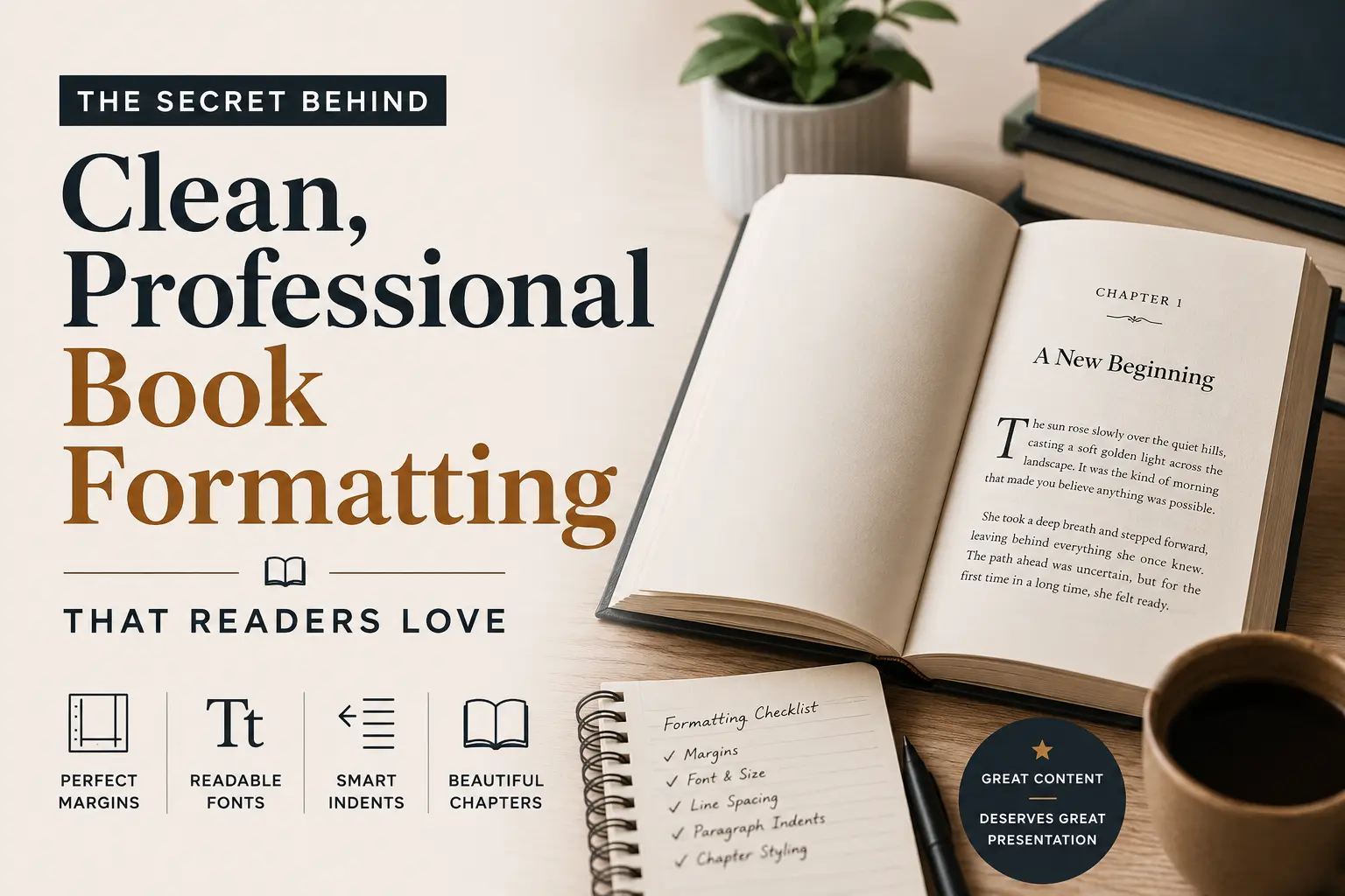
Okay this one specifically is what made my first book look immediately amateur and I did not even know it was a thing until someone pointed it out to me. In properly formatted printed books, the first paragraph after a chapter heading sits completely flush with the left margin. No indent at all. Then every paragraph after that uses a small indent, somewhere around 0.3 to 0.5 inches.
What most of us do instinctively, because it is what we learned writing essays and emails and everything else, is add a blank line between paragraphs. That works fine on the internet. It looks wrong in a printed book. The indent alone is enough to signal a new paragraph and adding extra space on top of it makes the pages look oddly gappy and unfinished.
The Way Chapter Openings Feel to a Reader
Every time a reader starts a new chapter they are making a small transition. They finished something and they are stepping into something new. Good formatting acknowledges that transition by giving the chapter opening some breathing room, dropping the actual text down to roughly a third of the way down the page. All that white space above is not wasted space. It is intentional. It is a visual pause.
The chapter number and title live in that upper portion, sometimes with simple design touches, sometimes just with generous spacing around them. The font used for headings usually differs from body text but feels like it belongs in the same world. That contrast helps readers find their place when they are flipping through and gives the book a sense of visual organization that feels natural rather than forced.
Print Books and Ebooks Need to Be Formatted Separately
I genuinely cannot tell you how much time I lost trying to make one file work for both formats. It does not work. Someone should have told me that at the very beginning and I am telling you now so you do not repeat my mistake.
When you format a print book you are working with fixed measurements. A specific page size, specific placement for every element, margins that do not move. Everything is locked into place and needs to stay there. When you format an ebook you are working with something that is going to look different on every single device it is read on. People change font sizes, switch to night mode, read on their phone during a commute and then pick up a tablet at home. A properly formatted ebook bends around all of that without breaking.
This means ebooks need structures that reflow naturally. Page numbers in the body text become meaningless when the layout shifts based on someone’s font preferences. Navigation needs to be clickable. Fixed layouts that look perfect on one screen look genuinely broken on another.
Taking a print file and just converting it to ebook format almost never works well. Both versions deserve their own attention if you want both to feel like they were made by someone who cared about the end result. This is something every guide on professional book formatting will tell you and it is one of those things you really have to experience getting wrong before it properly sinks in.
Honest Thoughts on the Tools Out There
Vellum
If you have a Mac, most of the self published authors I know eventually end up at Vellum and most of them stay there. It is clean and intuitive in a way that design software usually is not. You bring your manuscript in, work through some genuinely thoughtful template choices, and export files that look professional for both print and digital. You do not need any design background to get good results out of it. The frustrating part is it only runs on Mac and that locks out a lot of people.
Atticus
Atticus runs in a browser which means it works on any computer. It does what Vellum does in most of the ways that matter and the results are genuinely solid. For authors who want real control over how their book looks without having to learn actual design software it is worth spending time getting comfortable with it.
Adobe InDesign
Professional book designers use InDesign and the learning curve makes it obvious why most people do not just casually pick it up. It gives you total control over everything on every page which is powerful and also slow going until you really know it. If you are planning to publish many books over a long period and handle your own interior design throughout, learning InDesign eventually makes sense. If you are working on your first couple of books there are better uses of your time right now.
The Mistakes That Keep Showing Up
Double spaces after periods appear in almost every manuscript from writers who learned to type before modern word processing became standard. One space is correct in contemporary typography. A simple find and replace before you start formatting will clear all of them out.
Widows and orphans, those single lines of text that end up stranded alone at the top or bottom of a page away from their paragraph, show up even in books that are otherwise carefully done. They mess with the visual rhythm of a page in a way that readers feel even when they cannot name it. Most formatting software handles this automatically but a final read through still catches things that slip past.
Heading styles that drift slightly from chapter to chapter are another one. If your chapter titles are not completely consistent in size and weight throughout the entire book it creates a low level sense of disorder that readers pick up on without being able to explain it.
Here Is Why Any of This Actually Matters
Readers form their first impression of a book before they read a single word. In the first few seconds of opening it their eyes take in the whole page and make a judgment. That judgment either creates trust or quietly removes it before the reading even begins.
This is exactly why professional book formatting is not something you should figure out after your manuscript is done. It should be part of how you think about your book from the beginning. The authors who understand this early on are the ones whose books feel genuinely polished when readers pick them up.
Whatever you put into writing your book, months or years of real time and real effort, it deserves to live inside something that treats it with that same level of care. And that is what professional book formatting comes down to at the end of the day. Not a checklist, not a technical exercise, just genuine respect for the reader sitting on the other side of the page.