



05 Oct 2026
A few years back I watched a friend spend fourteen months writing her first book. Fourteen months. She did the research, rewrote the opening chapter probably six times, sent it to beta readers, incorporated their notes, and then finally hit publish on Amazon. Two weeks later she had eleven reviews. Nine of them mentioned the formatting. The text was running together, the chapter breaks were invisible, and on a Kindle Paperwhite the whole thing looked like one long, unbroken wall of words.
She had no idea any of that was coming. She thought once the writing was done, the hard part was over. And honestly, before I knew better, I would have thought the same thing.
eBook formatting is one of those skills that nobody talks about in the writing communities, in the author Facebook groups, in the self-publishing podcasts, until something breaks. Then suddenly everyone has an opinion. My goal with this guide is to put that knowledge in your hands before anything goes wrong, not after.
This is not going to be a dry technical breakdown either. I find those exhausting to read. Instead I am going to explain what actually matters, why it matters, and what to do about it, the way I would if we were sitting across from each other at a coffee shop and you had just told me you were about to publish your first eBook.
Nobody Warned Me Pages Do Not Actually Exist in eBooks
This was my first real surprise when I started learning about eBook formatting. Physical books have pages. You design them, they stay exactly as designed, and every reader sees the same thing. Simple enough.
eBooks do not work that way at all. The text in a digital book is more like water than it is like ink on paper. It fills whatever container the reader puts it in. Open your book on a Kindle Paperwhite with the font set to small, and it flows one way. Open it on an iPad with accessibility settings cranked up to large text, and it flows completely differently. Open it on a phone at midnight with a dark background enabled, and the app changes the colour scheme automatically.
None of that is in your control. And it should not be. That flexibility is what makes eBooks accessible and readable for a wide range of people.
But it does mean that if your formatting is held together with manual spacing, doubled carriage returns, and Tab key indents, the whole thing can fall apart the moment a reader adjusts a single setting. The fonts stop making sense. The headings look like body text. The table of contents just sits there, decorative and completely useless, not linking anywhere.
I have seen readers leave reviews about this. Not just mentioning it, but leading with it. One star. “Could not get through it because of the formatting.” Fourteen months of work, reviewed on its paragraph spacing.
This is why eBook formatting is worth your time. And this is why publishing on Amazon Kindle Publishing without understanding it first is genuinely risky. Amazon’s return data feeds their algorithms. Books that get returned a lot rank worse. Formatting problems cause returns. The connection is direct.
File Types, Explained Without Making You Feel Like an Idiot
When I first started researching eBook publishing, the file type conversation made my eyes glaze over. EPUB, MOBI, KFX, AZW3, DOCX, PDF. Every article seemed to assume I already knew what half of these were.
So let me just go through them plainly.
EPUB: This Is the One You Need to Know
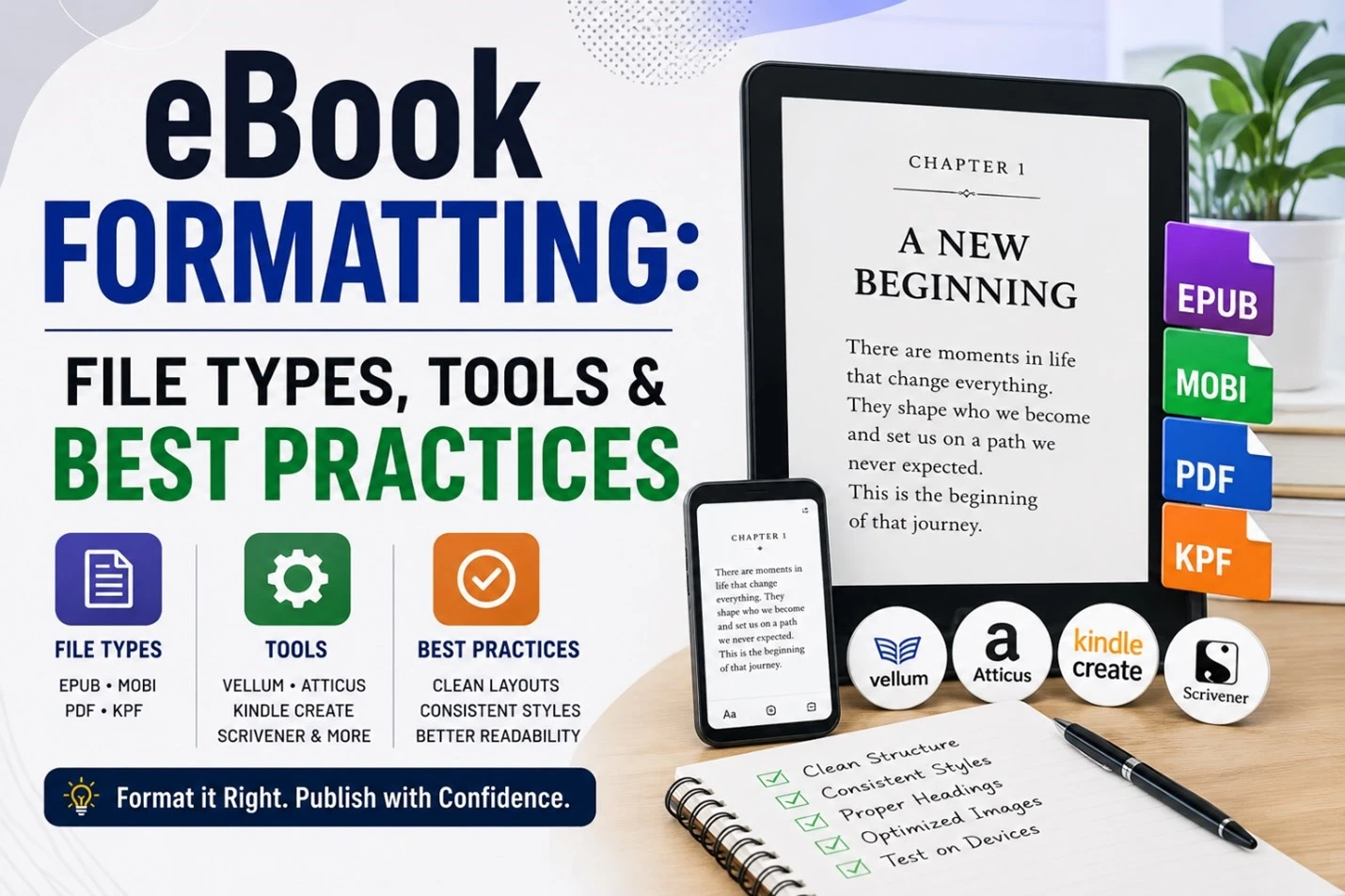
EPUB is the standard format the world runs on outside of Amazon. Apple Books, Kobo, Google Play Books, Barnes and Noble, Scribd, OverDrive (which is how most library apps work), all of them use EPUB. If you are distributing your eBook anywhere other than Amazon exclusively, you are going to need a good EPUB file.
The format itself is basically a zipped-up website. HTML for the content, CSS for the styling, XML for the structure. That is relevant because it means the people who built it were thinking about flexibility and accessibility from the start. It handles reflowing text gracefully. It works with screen readers. It supports multiple languages properly.
There are two versions still floating around: EPUB 2 and EPUB 3. EPUB 2 is old. It still works, but you would be starting a renovation by installing a fax machine. EPUB 3 is the current standard and it is what you should be producing. Most modern formatting tools default to EPUB 3 now anyway.
MOBI and KFX: Amazon Built Its Own Thing and Never Really Apologised for It
For years the Kindle ran on MOBI, a format Amazon acquired and adapted. It did the job, more or less. Then Amazon developed KFX (Kindle Format 10), which supports better typography, smoother page turns, and the Page Flip feature on newer devices. KFX is what Kindles actually read now.
Here is the thing though: you do not make KFX files yourself. When you upload to Amazon Kindle Direct Publishing, Amazon’s system converts whatever you give it into KFX on their end. Your job is to give them something clean enough that the conversion does not go sideways. The formats they recommend uploading are either a well-structured EPUB or a DOCX file. More on what “well-structured” means in a minute.
PDF: Useful for a Specific Kind of Book, Wrong for Most
PDFs are fixed. The layout does not move. Every reader sees the same thing, the same page, the same font, the same spacing, regardless of screen size or settings.
For certain books, that is exactly right. Workbooks, planners, cookbooks with careful layouts, children’s picture books, any book where the visual design of the page is part of the experience. PDF works great for those.
For a novel, a business book, a memoir, a how-to guide? PDF is the wrong choice. Readers on phones have to zoom in, scroll sideways, zoom out, scroll again. It is miserable. Nobody finishes a PDF novel on their phone. Stick to EPUB and let the Kindle workflow handle the rest.
DOCX: Your Starting Line, Not Your Finish Line
Most eBook writing happens in Microsoft Word. That is fine, Word is a capable tool, and the DOCX format is perfectly usable as a source file for conversion.
The problem is what authors do inside Word. When you manually select a heading and change the font size, when you press Tab at the start of every paragraph, when you create “spacing” by hitting Enter twice, you are writing invisible garbage into your document that conversion tools either misread or ignore entirely. I know that sounds harsh. But I have opened DOCX files that were formatted this way and tried to convert them, and the output is genuinely painful.
The right approach is using Word’s built-in paragraph styles. Heading 1 for chapter titles. Heading 2 for subheadings. Normal for body text. It sounds simple because it is. The difficulty is just in breaking the habit of doing it the old way.
Quick Comparison: eBook File Formats
| Format | Good For | Where It Works | Text Reflows? |
| EPUB 3 | Almost every eBook | Apple, Kobo, Google, B&N, libraries | Yes |
| KFX / MOBI | Kindle readers | Amazon only | Yes |
| Visual books, workbooks | Any device (but uncomfortable) | No | |
| DOCX | Drafting your manuscript | Source file for conversion | N/A |
The Tools I Have Actually Used and What I Think of Them
There are a lot of tools that claim to solve eBook formatting. Some of them are genuinely good. Some of them are good for a specific type of author. And at least a couple of them I would not recommend to someone I liked. Here is where I land on the main ones.
Atticus: The One I Usually Recommend First
Atticus is browser-based so there is no installing anything, which matters more than you might think when you are already juggling a dozen new things. You write in it, format in it, and export directly to EPUB or PDF. It covers both eBook formatting and print layout, so if you ever want to do a paperback alongside your digital edition, you are not starting over in a different tool.
For most authors, especially those who are newer to eBook publishing, it clicks quickly. The interface does not make you feel like you need a certification to operate it.
Vellum: Genuinely Beautiful, Mac Only, Not Cheap
If you are on a Mac and you are serious about how your finished book looks, Vellum is the tool. The output is honestly gorgeous. The chapter headers, the ornamental dividers, the front matter handling, it all feels considered in a way that other tools sometimes do not. The EPUB files it produces are clean and valid every time.
The price point is real. And it only runs on Mac. Those two things knock it out of reach for a lot of people. But if neither of those is a problem for you, it is the best eBook formatting software I have used personally.
Calibre: Free, Powerful, Ugly as Sin
Calibre has been around forever and it is free. It converts between virtually every format that exists. It has a full EPUB editor built in. If you get comfortable with HTML and CSS it gives you a level of control that none of the visual tools match.
The interface looks like it was designed in 2008 and someone decided updating it would be cheating. If you can get past that, and if you are the kind of person who genuinely likes tinkering, Calibre is remarkable. If you want something that feels like modern software, you will find it frustrating.
Kindle Create: Does One Job and Does It Fine
Amazon built Kindle Create for people publishing through Amazon Kindle Direct Publishing and for nothing else. You drag in your DOCX, apply a theme, preview it against simulated Kindle screens, and export. That is it.
It is not exciting software. But for someone distributing exclusively through Amazon who just wants to know the thing will look right on a Kindle, it removes a lot of the uncertainty. Sometimes that is exactly what you need.
Scrivener: A Writing App That Can Also Format
Scrivener is really a writing environment first. Authors who love it tend to love the way it lets you work in chunks and assemble them later. The compile feature, which is how you turn your Scrivener project into a finished file, can export to EPUB, MOBI, or DOCX and it works well once you figure it out.
“Once you figure it out” is doing a lot of work in that sentence. Scrivener has a real learning curve. But for anyone doing long-form eBook writing who wants everything in one place, it is absolutely worth exploring.
The Stuff That Actually Determines Whether Your eBook Works
Tools are just tools. What you do inside them is the part that matters. These are the principles I come back to every time.
Use the Styles. Please. Just Use the Styles.
I know I already said this but I want to say it again because it is that important. The single most common root cause of eBook formatting problems is authors who manually format their text instead of using paragraph styles.
When you click on a paragraph and manually change the font size to make it look like a heading, it looks like a heading inside Word. It does not behave like a heading when converted. The conversion tool has no idea it is a heading. It is just bigger text to the converter, and bigger text often gets stripped or mangled in the process.
Heading 1 means something. Normal means something. Block Quote means something. These style names are instructions, not just labels. Use them from the very start of your eBook writing process, not as a cleanup step at the end.
Typography: You Have Less Control Than You Think, and That Is Fine
Most eReaders let readers choose their own font, their own size, their own spacing. On a Kindle, I usually switch to Bookerly medium with 1.5x spacing and a warm background. Someone else might prefer a sans-serif at large size with maximum brightness. Both of us are reading your book our way, and your font choices are mostly getting overridden.
So what is actually in your control? Structure. Heading hierarchy. Paragraph logic. Chapter breaks. And most importantly, your table of contents. Those things survive the reader’s customisations. Make them solid.
Images Are Where I See the Most Mistakes from Experienced Authors
New authors often just skip images. Experienced authors add them and assume it will be fine. It is frequently not fine.
For EPUB formatting, keep your images as JPEG or PNG, aim for 72 to 96 DPI, and watch your file sizes. eReaders have limited memory and slow processors compared to computers. A bloated image file takes ages to load and sometimes just fails to display. Anchor images in line with your text rather than floating them. Floating images jump around between screen sizes in ways you cannot predict.
If you are also planning a print edition through Amazon Kindle Publishing, use 300 DPI for images from the start. Better to have higher resolution images and compress for digital than to need to redo everything later.
Your Table of Contents Needs to Actually Work
I am going to say something that sounds obvious but apparently is not: your table of contents needs to be clickable. Not decorative. Not typed out by hand as regular text. Actually clickable, linked, navigational.
On Amazon Kindle Publishing and most other eBook publishing platforms, a working navigational TOC is a requirement, not a nice-to-have. If you have been using heading styles throughout your document, your formatting tool can generate one automatically. If you have been manually formatting headings, you cannot. That is another reason the styles thing matters so much.
Metadata Is Invisible and It Is Also Extremely Important
Metadata is the information baked into your file: title, author, language, subject categories, description. Readers never see it directly. Amazon Kindle Direct Publishing’s search algorithm, however, sees nothing else. Your categories and keywords determine which search results you appear in, which reader recommendations include you, and whether people who would genuinely love your book actually find it.
Fill it in completely. Before you upload anything. This is the part of eBook publishing that feels like admin and actually functions like marketing.
Actual advice worth following: Amazon’s Kindle Previewer 3 is free. Download it. Before you publish anything through Amazon Kindle Direct Publishing, run your file through Previewer and check every device type it simulates. Paperwhite, Fire tablet, iOS, Android. All of them. It takes maybe fifteen minutes and it has caught problems in files I was absolutely certain were fine. It will catch things in yours too.
Amazon-Specific Stuff You Should Know Before You Upload
Publishing through Amazon Kindle Direct Publishing is different from distributing through other platforms, and it has its own quirks.
What Amazon wants from you is a clean EPUB or a well-structured DOCX. What they do with it is convert it into KFX format on their end before it ever reaches a reader’s device. Every time a file gets converted it has the potential to pick up errors. So the fewer conversions your file goes through before it reaches Amazon, the better. Do not convert your Word file to EPUB using one tool, then run that through another tool to fix something, then upload the result. Start clean, convert once, upload.
There is a feature called Amazon Enhanced Typesetting that adds drop caps, refined hyphenation, and typographic ornaments to qualifying books automatically. You do not have to apply for it or configure it. But your file has to be structurally clean enough for Amazon’s system to apply it. Messy files do not get Enhanced Typesetting.
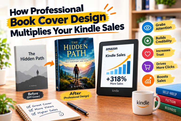
The cover image is worth spending real time and money on. Amazon’s minimum is 2,560 x 1,600 pixels, JPEG or TIFF, with a height-to-width ratio of about 1.6:1. The cover is what appears in search results before a reader has read a single word of your description. A pixelated or badly proportioned cover turns people away before they have any idea what your book is about. Do not let that be the thing that costs you readers.
Mistakes I Genuinely See All the Time
Some of these I made myself. Some I have watched other authors make. All of them are avoidable.
- Indenting paragraphs with the Tab key. eReaders render Tab characters inconsistently across apps and devices. Some ignore them entirely. Use paragraph style indentation. That is what it is there for.
- Loading up the file with three or four embedded fonts. Every embedded font adds weight to your file. eReaders are not powerful machines. Two fonts is plenty. One is often enough. Keep it light.
- Never running EPUBCheck. EPUBCheck is free. It scans your EPUB file and tells you exactly what is structurally wrong with it. Uploading an EPUB to any platform without running EPUBCheck first is like submitting a job application you have not proofread. The errors are in there. You just cannot see them yet.
- Converting the file multiple times through multiple tools. Each pass introduces new potential for errors. Decide on your tool, convert once, check the output, then upload. That is the workflow.
- Treating accessibility as optional. EPUB 3 has accessibility standards that actually matter. Alt text on images, logical reading order, semantic heading structure. More eBook publishing platforms are moving toward requiring these things. And separate from the requirements, your book becomes readable for people with visual impairments. That is worth doing on its own.
Last Thing, and Then I Will Let You Go
My friend with the fourteen-month book eventually reformatted the whole thing. It took her a weekend once she knew what she was doing. The reviews shifted. The book found its readers. It had a happy ending.
But she should not have had to do it twice. Nobody should. And you do not have to, because you are reading this before you publish rather than after something goes sideways.
eBook formatting is genuinely learnable. The file types are not mysterious once someone explains them plainly. The tools are accessible. The principles, use your styles, validate your files, test before you publish, fill in your metadata, take your cover seriously, are not complicated. They just require knowing them first.
Whatever tool you end up using, whatever platform you publish on, that is the foundation. Get the foundation right and your book can do what it is supposed to do: find readers and actually get read.
You put serious work into your writing. Do not let something fixable be the reason it does not land.