


20 Apr 2026
Let me be honest with you: formatting nearly made me quit publishing my first book. Not the writing part. Not finding a cover designer. The formatting. This guide is everything I wish someone had told me before I spent three days fighting a corrupted EPUB file.
Why Formatting Quietly Makes or Breaks Your Book
Here is something most writing advice skips past entirely: readers do not consciously notice good formatting. They just read. But they absolutely notice bad formatting, even if they cannot name it. They feel the friction of a chapter that does not break properly, or they squint at text bunched too tightly together. Within a few pages, they have already decided something feels off about this book.
On Amazon KDP, Apple Books, and Kobo, that “something feels off” reaction turns into a return. And returns pile up quietly in the background, dragging down your ranking and showing up in reviews where someone says the book “felt unpolished.” They are not wrong. They just do not realize the writing was fine. The formatting was the problem.
Good eBook formatting is not glamorous work. Nobody posts about it on Instagram. But it is the difference between a reader finishing your book and recommending it, versus someone asking for a refund after chapter two.
Worth Knowing
Amazon KDP tracks return rates per title. If your book gets returned at a higher-than-average rate, it can affect how the algorithm displays your book to new readers. Formatting problems are one of the most common triggers for returns on fiction titles.
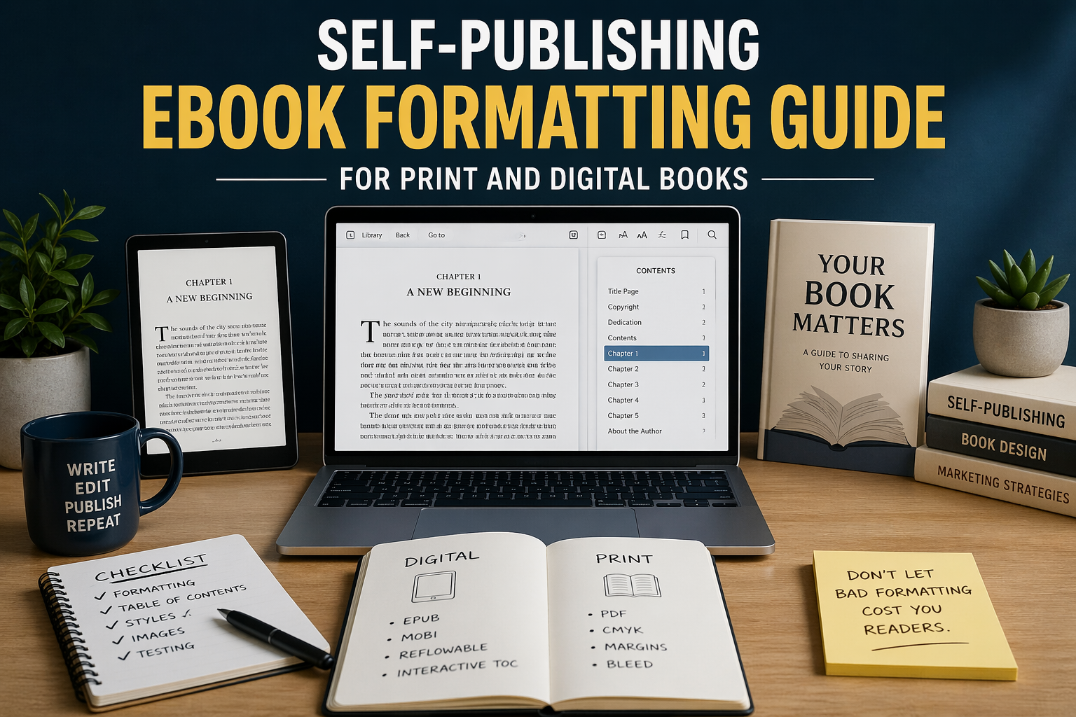
Digital vs Print: They Are Genuinely Two Different Jobs
I have watched authors waste real money having one formatted file “adapted” for both print and digital. It does not work that way, and any formatter who tells you otherwise is either inexperienced or hoping you will not ask too many questions.
Digital eBook formatting
When someone reads your eBook on their Kindle, they can change the font size, switch to a different typeface, or flip to night mode. The text has to flow and reformat itself on the fly. This is called a reflowable layout, and it means you cannot treat your digital book like a printed page. There are no fixed line breaks. Images shift. Font choices you made in Word simply do not carry over.
The file formats are EPUB (used by almost every platform) and MOBI (used by older Kindle devices, though Amazon largely relies on EPUB submissions now). What sits inside those files is essentially a web page: HTML for structure and CSS for visual styling. Which means hidden formatting in your Word doc, the kind you created by hitting Enter five times or centering text with spaces, becomes a mess of broken code underneath.
Print book formatting
Print is the opposite problem entirely. Everything is fixed. You are designing a physical object with specific dimensions, and the printer needs exact margins, bleed settings, embedded fonts, and CMYK color. You deliver a PDF, and what you see on screen is precisely what comes off the press. There is no reflowing, no user preference, no second chance once it goes to print.
“Print formatting is designing an object. eBook formatting is designing an experience. Confuse the two and you will frustrate yourself enormously.”
Getting Your Digital eBook Right the First Time
Start with a clean manuscript. This sounds obvious, but “clean” means something specific here. No tabs for indentation. No extra blank lines between paragraphs. No centering achieved by pressing the spacebar 40 times. Every one of those shortcuts creates invisible characters that the EPUB conversion process reads as actual content. Your beautifully formatted Word document becomes a disaster when converted.
Instead, set up paragraph styles. In Word, this means creating a named “Body Text” style and a “Chapter Heading” style and applying them consistently throughout. Scrivener has its own system for this. When your formatter runs the file through conversion software, those styles translate into proper HTML tags that render correctly on every device.
Your finished eBook needs a few non-negotiable elements. A working linked table of contents (not just a visual list, but one that actually navigates). A copyright page formatted correctly. Front matter in the right order: title page first, then copyright, dedication, and then your table of contents. Chapter breaks that create genuine section divisions. And if you have images, they need to be optimized. A 6MB photograph from your camera does not belong in an eBook file.
Practical Detail
Amazon recommends keeping your KDP eBook file under 50MB total. Every megabyte above a certain threshold gets charged back to you as a delivery fee, which chips away at your royalty on every single sale. Compress your images before they go into the manuscript.
What Print Formatting Actually Involves
If you are publishing through IngramSpark, Amazon KDP Print, or Lulu, each has slightly different specs. Download their interior template before you start designing, not after. The trim size sets your page dimensions, and the most common choices are 5×8 for fiction, 6×9 for nonfiction and business titles, and 8.5×11 for workbooks and course materials.
Margins are where a lot of first-timers get caught out. The gutter is the inner margin, the one closest to the spine. Because the binding swallows some of that space, your gutter needs to be wider than your outer margins. For a book around 300 pages, budget at least 0.75 inches for the gutter. Outside, top, and bottom margins can sit around 0.5 to 0.75 inches. Go too narrow and the printer clips your text during trimming.
For body text, stay in the 10pt to 12pt range and choose a real print serif font. Garamond, Caslon, and Palatino all work well. Fonts designed for screen reading look thin and odd on paper. Line spacing around 1.15 to 1.3 times your font size gives the page some breathing room without making the book feel padded.
Hiring eBook Formatting Services: What to Actually Look For
A lot of authors hire eBook formatting services because they simply do not want to spend their weekend learning the difference between EPUB 2 and EPUB 3. That is a completely reasonable decision. But not all formatting services are equal, and the ones that are not will cost you time fixing their mistakes.
Before you hand over your manuscript, ask for samples. Not screenshots. Ask them to send you an EPUB file you can load into an actual reading app on an actual device. Check whether the table of contents navigates properly. Look at how images render. Read a few pages on a phone, not just a widescreen monitor.
Confirm exactly what the price covers. Some services include both EPUB and MOBI. Others charge separately for print interior formatting. Ask how many revision rounds are included, because you will almost certainly need at least one round of corrections after the first draft comes back. And ask whether they have formatted books in your specific genre. A heavily illustrated cookbook requires a completely different skill set than a straightforward thriller novel.
Price-wise, a basic text-only novel typically runs $50 to $200 for eBook formatting. Complex books with tables, charts, or lots of images cost more. Print interior formatting is usually priced separately and runs in a similar range. Be cautious of services that quote far below market rate, the quality tends to match the price.
Mistakes I See Authors Repeat Constantly
The biggest one is submitting a Word document built with manual formatting. Authors spend hours getting their document to look right on screen using blank lines, tab stops, and manual spacing, then wonder why the EPUB looks nothing like what they handed over. The answer is that Word’s visual output and Word’s underlying structure are two different things. Formatters and conversion software work with the structure, not the preview.
The second most common mistake is only previewing the finished file on a computer. Your book might look perfect in Adobe Digital Editions on a 27-inch monitor. Load it onto a Kindle Paperwhite or an older Android phone and you may find something completely different. Always test on at least two actual devices before publishing.
Forgetting the linked table of contents is another one that trips people up, especially with nonfiction. Amazon’s guidelines require it for most nonfiction eBooks. Skip it and your book can get flagged or rejected after upload. And do not ignore your end matter either. An author bio, links to your other titles, and a short note asking readers to leave a review take maybe two pages and dramatically increase the chance that a reader does something valuable after finishing your book.
Software Worth Your Time
If you are on a Mac and want the most polished output with the least technical friction, Vellum is worth the price. It produces clean EPUBs and print PDFs and shows you a live preview across multiple device types as you work. For authors who publish multiple books, the one-time cost pays for itself quickly.
Windows users have Atticus, which does much of what Vellum does and has been improving steadily. For a completely free option, Draft2Digital’s formatting tool handles straightforward text-heavy manuscripts reasonably well, though it gives you less control over the finer details. If you want total control and do not mind a learning curve, Adobe InDesign with the Kindle Export plugin is what professional publishing houses actually use, and it handles both digital and print with precision.