


27 Apr 2026
I remember the first time I downloaded an eBook that just felt wrong. I could not explain it at the time. The writing was decent, the topic was interesting, but something kept pulling me out of the reading experience. Pages felt cramped. A chapter heading appeared randomly in the middle of a screen with no content following it. Font sizes shifted for no reason. I closed the book after twenty minutes and never went back. Later I realized what the real problem was proper eBook formatting, or more precisely, the complete lack of any professional attention to it. That one experience taught me more about why formatting matters than any tutorial ever could.
Here is something most writing coaches will not tell you: a badly formatted eBook can kill a good book. Not slowly, either. It happens the moment someone opens the file.
What Your Reader Sees Before They Read Anything
Think about the last time you walked into a restaurant that looked messy before you even sat down. Sticky menus, wobbly chairs, a floor that needed sweeping. The food had not arrived yet but your brain had already started forming opinions. Reading an eBook works the same way.
Before a single sentence registers in your reader’s mind, their eyes are already scanning the page and making judgments. Is the text too big? Too small? Do the chapter headings look styled intentionally or slapped on with no thought? Is there breathing room on the page or does everything feel squeezed together?
Amateur formatters usually do not think about any of this because they are focused on the writing itself, which makes complete sense. But professional eBook formatting is built around one core idea: the reader should never notice the format. If they notice it, something has already gone wrong. Every margin, every line height, every heading style is either supporting the reading experience or quietly undermining it. There is really no middle ground.
“The reader should never notice the format. If they notice it, something has already gone wrong.”
The Way Most First-Timers Actually Format Their Books
I have talked to dozens of self-published authors about their formatting process and almost all of them describe the same thing. Write in Word or Google Docs, finish the draft, find some conversion tool online, upload the file, and move on. Maybe they spent an afternoon watching tutorials. Maybe they just guessed.
And honestly? For a very basic text-only book, that sometimes works out okay. Sometimes. But most of the time what comes out the other end is a file full of hidden problems that the author never sees because they are testing their own book on one device, in one app, at one font size.
The real issues show up when actual readers get hold of it. A heading that looks fine on a Kindle Fire looks completely different on an older Paperwhite. Paragraph spacing that seems normal on an iPhone becomes awkward on an Android tablet. Tables and images that appeared clean in the Word document turn into scrambled messes inside an eReader app that handles positioning differently.
Word processors were designed to create print-ready documents. eBooks are not print documents. They are closer to websites. The underlying file structure of a standard EPUB is essentially HTML and CSS packaged together, which means the quality of your eBook ultimately depends on the quality of that code. Most automatic conversion tools produce code that is bloated, redundant, and full of conflicts. It works just enough to not look obviously broken, but a trained eye can spot the problems immediately.
What Actually Goes Into Professional eBook Formatting
The first time a real formatter looks at a manuscript, they are not reading the story. They are looking at the structure. How are the headings organized? Are the styles consistent throughout? Are there any formatting overrides buried in the document that will cause problems during conversion?
Professional eBook formatting is about building a clean foundation before anything else. That means setting up proper heading hierarchies so the table of contents generates correctly and every chapter link actually works. It means using relative font measurements instead of fixed pixel values so readers can adjust text size without breaking the layout. It means handling images in a way that keeps them anchored correctly across different screen ratios.
None of this is glamorous work. Most of it is invisible when done right. But skipping any piece of it creates problems that show up in the worst possible moments, like when a reader screenshots a broken page and posts it in a review.
Professional formatters also test their work across multiple devices and reading apps before calling anything finished. Not just Kindle. Not just one phone. Because the same file can behave completely differently depending on the software rendering it, and assuming it looks fine everywhere based on one test is one of the most common mistakes in amateur work.
✅ What Professional Formatters Do That Amateurs Skip
- Set proper heading hierarchies for working table of contents
- Use relative font values so reader settings are respected
- Anchor images correctly across different screen sizes
- Write or generate clean, validated EPUB code
- Test across multiple devices and reading apps before delivery
- Handle chapter breaks so headings never appear orphaned on screen
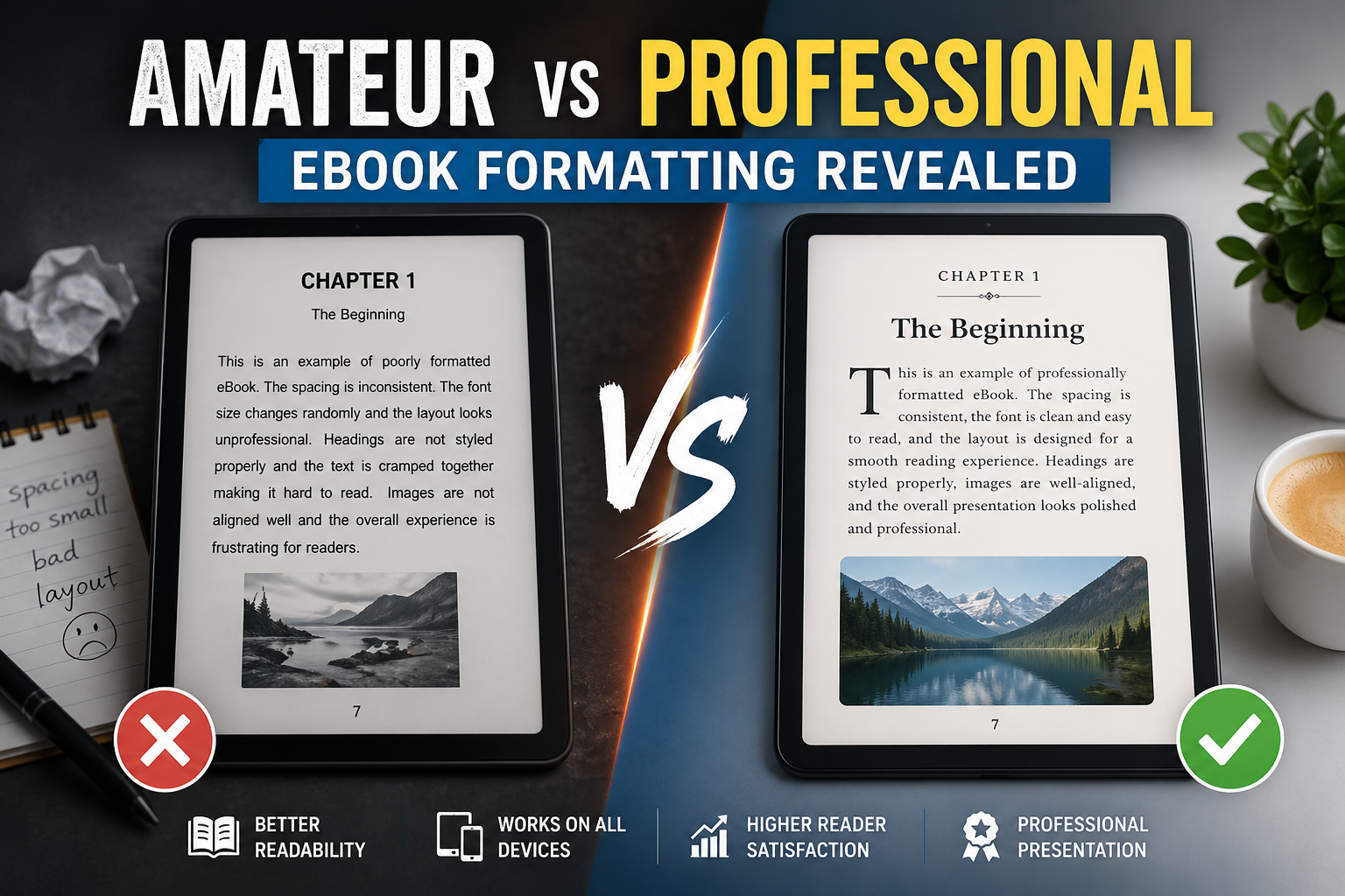
The Little Things That Instantly Signal Amateur Work
You start to recognize the patterns after a while. There are certain formatting problems that show up so regularly in self-published eBooks that spotting them becomes almost automatic.
Paragraph spacing is usually the first thing I notice. In a well-formatted book there is a clear, consistent logic to how paragraphs are separated. Either you use indentation at the start of each paragraph or you use spacing between them. Using both at the same time is a classic symptom of a Word document that was converted without cleaning up the base styles first. It creates a page rhythm that feels subtly wrong on every single screen, even if the reader cannot identify why.
Orphaned headings are another one. A chapter title floating alone at the very bottom of a reading screen, completely cut off from the text below it, is a sign that nobody added the code to force chapter starts onto a fresh screen. It is a small thing to fix but it makes a significant difference in how polished the book feels.
Then there is the font override problem. eBook readers are popular partly because people can customize their reading experience, bigger text, different fonts, brighter or dimmer screens. When a formatter hard-codes specific font sizes into the text rather than using flexible relative values, they are essentially overriding the reader’s preferences without their permission. Somebody who relies on large text for comfort opens the book and finds it ignores their settings completely. That is not a design choice, that is just a mistake.
❌ Amateur eBook Formatting Signs
- Inconsistent paragraph spacing
- Orphaned headings at screen bottom
- Hard-coded font sizes
- Broken drop caps on some devices
- Table of contents links that go nowhere
- Images that resize incorrectly
✅ Professional eBook Formatting Signs
- Consistent paragraph logic throughout
- Chapters always start on a fresh screen
- Relative font values that respect reader settings
- Drop caps that render correctly everywhere
- Fully linked, validated table of contents
- Images anchored and responsive
Why Getting This Right Matters More Today
The self-publishing space is genuinely crowded now. There are more eBooks available than any reader could get through in several lifetimes, which means readers have developed real instincts for filtering out books that do not seem worth their time. Formatting quality is one of those filters, even if most readers would never describe it that way.
A book that looks professionally put together creates trust before the first sentence. Not because readers are judging you harshly, but because our brains use visual polish as a shortcut for quality. It is the same reason a well-designed website feels more credible than a messy one, even when the information on both is identical.
The goal of solid eBook formatting is to get completely out of the reader’s way. When it works, the reader just reads. They get absorbed in the content. They forget they are looking at a screen. The moment they start noticing weird spacing or a heading that appears in a strange place, you have lost them a little, and every small moment of friction adds up.
Figuring Out Which Route Is Right for You
This is where I think a lot of authors get stuck. They know their formatting needs work but they are not sure whether to learn the craft themselves or pay someone who already knows it.
My honest take is this: if your book is text-heavy with a straightforward structure, learning to format it yourself is completely realistic. Tools like Vellum, Atticus, and Sigil exist specifically to help authors handle this without needing to write code by hand. They are not perfect but they produce results that are significantly better than a raw document conversion, and with some practice the learning curve is manageable.
If your book has any real complexity, lots of images, tables, charts, custom design elements, technical diagrams, hire a professional and do not second-guess that decision. The cost of getting it wrong is higher than the cost of getting it done right the first time. Books with significant formatting errors can fail validation on retail platforms entirely, which means distribution delays and potentially lost sales during the launch window when momentum matters most.
📋 Quick Guide: Should You DIY or Hire a Professional?
Format it yourself if:
- Your book is mostly text with simple structure
- You are willing to spend time learning EPUB basics
- You plan to publish multiple books and want long-term control
Hire a professional if:
- Your book has images, tables, charts, or sidebars
- You are submitting to major retail platforms with strict validation
- Your launch timeline is tight and you cannot afford distribution delays
- This is a high-investment book you want to get exactly right
Either way, the single most important shift is treating eBook formatting as part of the book, not something you deal with after the real work is done. The authors who publish books that feel effortless to read got there because they took the whole package seriously, not just the writing.
That is genuinely what separates the two groups. Not talent. Not budget. Just the decision to care about every part of what the reader experiences from the moment they open the file.