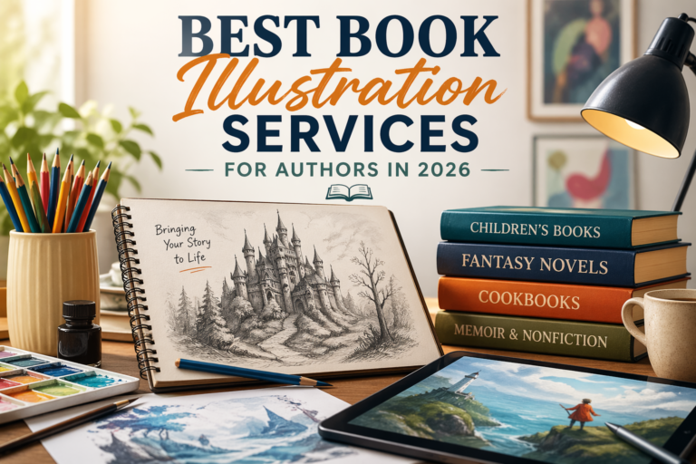


24 Apr 2026
Here is something most new authors find out the hard way. You can spend two years writing the most gripping story of your life, pour every emotion into it, edit it until your eyes blur, and still watch it sit completely unnoticed because the cover looks like it was thrown together in an afternoon. Good book cover design is not just the face of your book. It is the reason someone stops scrolling, clicks, and actually considers buying what you wrote. And honestly, in today’s overcrowded market, that one moment of stopping is worth more than most writers realize until it is too late.
Readers make snap judgments. Nobody likes admitting that, but it is simply how the brain operates when it is staring at a screen full of options. The cover speaks before anything else does. Before your blurb, before your five-star reviews, before your author bio with all its credentials. If that cover does not say something interesting in the first half second, the reader has already moved on and found someone else’s book.
📌 Key Insight: A reader browsing Amazon decides whether your book is worth their time before they read a single word. That decision happens in under a second and it is based entirely on your cover.
Why So Many Authors Get This Wrong
Most writers are not designers, and that is completely fine. The problem is not the skill gap itself. The problem is when people refuse to acknowledge it exists. When budgets feel tight, the temptation to open Canva, grab a nice stock image, slap a title font on top and call it a day is very real. The finished result usually looks perfectly acceptable to the author who made it. To a reader browsing Amazon though, it reads as amateur almost instantly, even if they cannot put their finger on exactly why.
What separates a homemade attempt from a genuinely professional book cover is not just cleaner visuals. It is the thinking behind every single decision on that cover. The font choice, the color balance, how much breathing room the title has, where the eye naturally travels when it first lands on the image. None of these things happen by accident when a real designer is working. Every element is doing a specific job, and every job points toward the same outcome, which is getting someone to pick up your book.
Genre conventions matter enormously here and most authors underestimate just how much. A reader who loves crime fiction has looked at thousands of crime covers over the years. They have built up a subconscious visual grammar for what that genre looks like, and a cover that breaks from it in the wrong ways creates an uneasy feeling they usually cannot explain. They just move on. Experienced designers know these unwritten rules the way a musician knows scales, and they work within them while still finding ways to make your specific book feel like its own thing.
What You Are Actually Paying For
When authors first hear what good cover design costs, the reaction is often immediate resistance. But it genuinely helps to think about what is actually being purchased for that money.
A designer who has spent years specifically on book covers has built up a kind of knowledge that does not come from general graphic design training. They have studied what sells and what does not inside the publishing world specifically. Typography alone is its own deep subject. The emotional difference between a clean serif and a jagged sans-serif, the way letter spacing can make a title feel urgent or calm, how large your author name should appear relative to the title depending on whether you are a debut author or a known name. These are not small details. They add up to something the reader feels without understanding.
Color choices work the same way. The particular shade of blue on a psychological thriller is not picked because someone thought it looked cool. It has been refined through observation of thousands of published titles and what kinds of readers they attracted. When a designer picks the palette for a professional book cover, they are drawing on that accumulated knowledge to trigger the right emotional response in exactly the right reader.
And then there is everything technical. Print covers need bleed areas calculated correctly, spine widths based on page count, back cover layout, and files exported at a resolution that will not fall apart on a physical press. Digital covers need to hold up at thumbnail size, which is genuinely more difficult than it sounds. A good designer handles all of this without the author having to think about it.
💡 What a Professional Designer Brings to the Table
- Deep knowledge of genre-specific visual conventions
- Typography expertise including font pairing, spacing, and hierarchy
- Color psychology tuned to your target reader
- Technical mastery of print specs, bleed, resolution, and file formats
- Thumbnail legibility testing so your cover works at every size
The Different Kinds of Designers Out There
Understanding your options before you start reaching out to anyone saves a lot of confusion and wasted time.Freelancers
Freelancers are where most independent authors start. Platforms like Reedsy, 99designs, and Upwork have large pools of designers offering book cover work. The quality varies widely, which means portfolio research is essential rather than optional. When you are going through someone’s work, the question to keep asking yourself is not whether the covers look attractive in a general sense. Ask whether they look like they belong on a shelf at a real bookstore, in the specific genre you are writing in. That is a different and much more useful question.
Premade Covers
Premade covers are an option a lot of authors overlook and probably should not. A designer creates a cover without any specific book in mind, lists it at a flat price, and sells it once to a single buyer. The buyer gets their title and name swapped in and walks away with a solid cover at a fraction of what custom work costs. The obvious trade-off is that you are working backward, finding a design that fits your book rather than building one from scratch. But for the right project and the right budget, a quality premade is a genuinely smart choice.
Studios and Agencies
At the higher end, there are studios and agencies that focus specifically on publishing. These are full teams with illustrators, art directors, and people whose entire job is typography. The price reflects that, but so does the output. Authors building a long-term series or treating their writing as a serious business often find the agency investment worthwhile over time.
| Designer Type | Typical Cost | Best For |
|---|---|---|
| Premade Cover | $50 – $300 | Tight budgets, debut authors |
| Freelancer | $300 – $1,500 | Custom work, most indie authors |
| Studio / Agency | $2,000+ | Series, serious publishing investment |
How to Find Someone Worth Hiring
Finding a great designer takes more effort than most people budget for, and that is worth knowing upfront so you are not caught off guard.
Before you talk to a single designer, spend time on Amazon looking at bestselling titles in your genre. Study the covers without overthinking them. What colors keep showing up? What do the fonts tend to feel like? What kinds of images are used and how are they composed? You are not trying to copy any of this. You are building enough visual literacy to communicate clearly and specifically when you do sit down with a designer.
Reviews from actual authors who have used a designer tell you far more than anything on the designer’s own website. If you can find forum discussions, writing community threads, or social media mentions, those unfiltered accounts are worth reading. Pay attention to how designers handled disagreements, delays, and revisions, not just whether the final cover turned out well.
Ask direct questions before you commit any money. How many rounds of revisions are included? What file formats will you receive? How do they handle it if you and they simply disagree on a direction? The answers reveal a lot about what the working relationship will actually feel like.
✅ Questions to Ask Before You Hire
- How many revision rounds are included in your package?
- What file formats will I receive at the end?
- Do you have experience designing covers in my specific genre?
- How do you handle it if we disagree on a creative direction?
- Can I see examples of your print-ready files?
Warning Signs Worth Taking Seriously
A designer with no experience in your specific genre is a real gamble no matter how impressive their broader portfolio looks. Book cover design is not the same as general graphic design. The rules are specific to publishing, specific to genre, and specific to reader expectations built up over years. Someone who primarily works on brand identities or marketing materials is not automatically equipped to navigate that world.
If a designer seems vague or uncertain about print specifications, that is a problem worth taking seriously. Bleed areas, resolution requirements, spine calculations — these are standard knowledge for anyone genuinely working in publishing. Uncertainty here usually means the person has not done much real print work.
Pricing that seems unusually low deserves skepticism rather than celebration. Thoughtful, genre-aware cover design takes time and real expertise. When pricing drops below a certain point, something is being sacrificed, and it is usually the quality or the originality that suffers first. A cover that communicates cheapness to readers is extremely difficult to recover from commercially, even if everything else about your book is excellent.
🚩 Red Flags to Watch Out For
- No portfolio work in your specific genre
- Vague or uncertain answers about print specs, bleed, or DPI
- Pricing that feels suspiciously low
- No clear revision policy before payment
- Portfolio full of brand logos but no book covers
Getting the Most Out of Working With a Designer
Authors who walk away with covers they love are almost always the ones who showed up to the collaboration prepared. That does not mean arriving with a rigid blueprint of exactly what you want. It means arriving with the right information.
Put together a short written brief before your first conversation. Explain your book clearly. Talk about who you wrote it for and what you want someone to feel when they look at the cover. Share examples of covers in your genre that resonate with you and be specific about why. That last part matters more than most people think. Saying why something appeals to you gives a designer real insight into your instincts, which helps them align their creative direction with yours from the beginning rather than discovering the disconnect three drafts in.
When a designer pushes back on one of your ideas, try to hear them out before reacting. A good designer will occasionally tell you that something you have in mind will not work commercially, and that honest feedback is part of what the investment is for. At the same time, nobody knows your book like you do. If something in a draft feels genuinely wrong, say so early and say it clearly. Sitting quietly on feedback and hoping the next version somehow fixes itself is one of the most reliable ways to end up with a cover you are not happy with.
📝 What to Include in Your Design Brief
- A clear summary of your book including genre, tone, and target reader
- The feeling you want the cover to create at first glance
- 3 to 5 existing covers in your genre that you genuinely like, with notes on why
- Any specific elements you want included or avoided
- Your publish date and format requirements such as print, ebook, or both
The Money Side of Things
Custom freelance work typically lands somewhere between a few hundred and around fifteen hundred dollars depending on the designer’s experience and what the project involves. Premade covers are considerably more affordable, often sitting between fifty and three hundred. Studio and agency work starts higher and can climb well past two thousand for complex or illustrated covers.
Measured against what a well-performing book can generate, these numbers are reasonable. But beyond the return on investment calculation, think about the cost of getting it wrong. A weak cover does not just fail to bring in new readers. It actively signals to experienced readers that the book may not be worth their attention. That signal affects not just individual sales but every potential sale that quietly never happens because of a first impression that did not land.
What It Really Comes Down To
There is a version of every book that finds its readers, and a version that quietly disappears without most people ever knowing it existed. Many things determine which version plays out: the writing itself, the marketing effort, the timing, the platform. But the professional book cover sits near the very top of that list because it is the first filter everything else has to pass through.
Writers who genuinely understand this stop treating cover design as a cost to minimize and start treating it as the investment that makes all their other efforts visible. Because a book that nobody picks up is a story that nobody reads, and there is no version of that outcome that feels acceptable after everything a writer puts into their work.
The Bottom Line
A book that nobody picks up is a story that nobody reads. Your cover is not a design expense. It is the investment that makes every other effort you put into your book actually visible. Treat it that way.